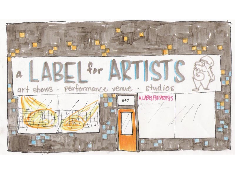
 This morning over breakfast Jenni, Lorne and I worked on this design. We saw a building in T bay with squares painted on it. It loked kinda cool, like an 80's video game. Now we are working on colour combos and fonts for the new sign. I am asking for your opinions.
didn't we do this exercise already? i guess that what happens when morley calls you the ugly duckling! :)
ReplyDelete...and in that story, the ugly duckling turns into a beauuuutiful swan. I think a new sign (and maybe a new carpet or floor / removing those green boards, and painting the black part above them white) could be a step in the right direction. But, yea we did this excercise before. I'll vote for a simple clean white sign that only says "Label" in sharp cut vinyl (formal looking with a non-bubbly font). Minimal signage would be nice, no Sam figure, no list of services, just a name. If you want to know what it is, go inside.
ReplyDeleteExcercise is good because of its repetition.
ReplyDeleteEnough with the drafts, time for action!
ReplyDeleteCall me when you begin!
how about tonight? heehee...
ReplyDelete