in the palm
of it`s claw
at the end
of it`s arm
snooze button this devil`s alarm
snooze button this devil`s alarm
in the interest of saving time
c`mon
let`s go for a ride
today`s outlook
is partly cloudy
but that`s only if you`re on the ground babe!
snooze button this devil`s alarm
(repeat and rinse)
9 comments:
Awesome!
totally. repeat and rinse, indeed.
and just as a friendly aside-- "it's" and "its" are often used incorrectly. in this case, it should be "its" claw and "its" arm, otherwise it says "it is claw", etc.
i only learned that one a few years ago AFTER graduating w/ a degree in English!
look at the work of Holger Kalberg. he was one of the RBC painting competition finalists, and is now studying in Europe. this work sort of reminds me of his stuff, which i don't normally like, but i like this one quite lotsly--yeah, that's right. i said "lots-ly".
Interesting comparison wolfboy...
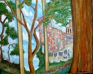
There's a certain banality to Kalberg's work that might be an interesting pursuit for Mr.Waterman. I can see the connection, a lone building, some abstract qualities.
With Kalberg's work there is also a strong sense of composition, either in the buildings or in the use of one or two point perspective. Another pursuit that might make Mr.Waterman's work truly strong. Hard, straight lines are another asset.(the posts really work for me, in contrast to the trees)
The composition is unsettling. That might be a good thing.
What building is that in the background? How does the poem/song connect with the image?
but the "it" in this refers to someONE. I wasn`t too sure if "its" in the right context.
It`s all just so frustratin`.
you must`ve beat me by seconds in your post James.
I shall investigate this Karlberg.
The image was more of a flow from sky`s post. The words kind of reflect the harsh lines of 9-5`s. rising mentally above the clouds to get through them.
let me add that i'm not a huge Kalberg fan--this reminds me of some of the better qualities of his work, though. i really like the way nature is squeezed out, almost like it's between bars. no Park-ing indeed.
p.s. Tom Thomson was a huge fan of "framing" his works with trees like this.
"i really like the way nature is squeezed out"... in this work, i meant.
and YET, after another look, i'd say that the trees in fact are "winning" here.
those two trees in the background look a lot like two of the trees in thomson's famous "jack pine", by the way.
Post a Comment