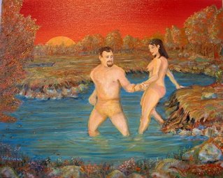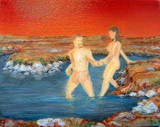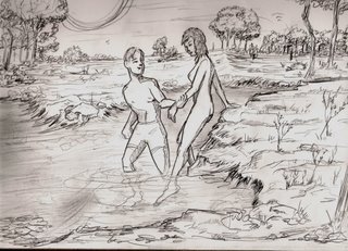

Rarely do I sketch before starting something. Usually I just keep making strokes until I see something. This was a comissioned piece, as per his description.
 the sketch was done before I knew what they looked like. The woman was pretty close. The reds were inspired by Dave`s "Microscapes". I had fun doing it, and I just may get back in to fleshing out ideas before starting. I`m curious to see other Alfa processes....
8 comments:
oh yeah, the guy had lost a ton of weight from the pic he sent me to work with. So I called him on it, and told him it wasn`t my fault!
IT'S INTERESTING TO SEE THE CHANGES IN THE IMAGE FROM IMAGE TO IMAGE. ALL THESE PIECES TOGETHER MAKE A DIALOGUE.
I think that my favorite is the drawing. well rendered! (sorry about the caps)
yeah, the drawing is with thanks from you contouring guys. I`m still learning to loosen up from you. I`ve never been an "eraser" per say, but to build on the fluidity (is that a word?) of the style is getting fun.
Very much like banging out a song. Usually the earlier versions end up being the best. Capturing an emotion?
I`d really like to see other peoples stages if they have any.
Nice work. This picture is wierd in a good way I think.
I'm curious why the drawing depicts a boy and girl, kinda sweet in a way, and then the painting takes on a very mature quality.
Perv.
I was thinking that the drawing of the boy looked like justin's son
I had no idea how the guy looked when I did the sketch. Is he bald? fat? tall? short? ect So I went with a very neutral boy.
MR J,
This is a great painting. It looks like it's fairly small too, so nice work with the details. I also love the strangeness of the sky and how it makes the blue green pop. The addition of the left foreground tree is a nice touch, it frames in that side nicely.
Post a Comment