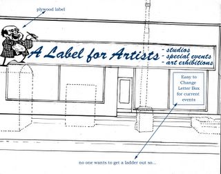


These are from the earlier excercise. I think the idea here was to have solid colours and remove the tile. In the new idea we use the tile to help grid squares. As for the sam/label figure. i think it is important because if it were not for Sam's AlfA would not have a home. We are also looking at having our mandate and a short history on the stage side window. thanks for your imput guys
16 comments:
I agree, Sam has to remain!
I also like the mandate and services listed on the outside. It will entice those too afraid to ask. I`ll bet there is a large body of students across the street that are still unaware of what goes on in that mysterious building by the bus stop.
Are you going to do this sign by yourselves (handmade) or do you have a budget (buying a new sign)?
by ourselves with a budget.
benefit show!
(kee-ripes man! the word verification was like 20 letters long! don`t ya hate that?) - just making the post worth my time after that "ordeal"
it might be a time to re-invent yourselves. new sign, new name, same idea. and from the ashes will rise something more wonderful.
Looks great gents. I'll volunteer when I have some time. I only have two jobs!!!!!!
I would recommend avoiding a list of services and mandate in the window, it will make you look like some Social Services Agency rather than a gathering place for like-minded artistic people.
I have always liked the tiles. Maybe if you kept a section of them (like around the window), gave them a good cleaning and replaced missing ones with the ones you remove, you can have a really clean and classy look.
Although it is great to have a brand new look, it is also important to celebrate the past. By retaining certain classic elements you retain the spirit of the building and the spirit of what Portage Avenue was before Fast Food restaurants, sleek condos and Terra Cotta stucco.
As for the signage, I would choose a font that exudes the Label spirit and avoid those cursives you are using now; it makes it look like a flower shop. This is a hip cool place for artists, let's keep that in mind. I also like the idea of having Sam. Did you ever thing of making one for the roof? He could be standing on the building overlooking the coming and goings (kind of like the Art City bike).
This is a great oppotunity to make a visual impact on Portage Avenue, and it should not be taken (or appraoched) lightly. Getting things made to professional standards make the whole project (inside and out) more credible and worrth it's salt.
If you Lableites like what I am saying and would like my help with the project, give me a shout, I would love to help.
Way to go! New sign new sign!
I agree with Denise, you should get him on board.
When is the unvieling scheduled? =)
no, no no! no one gets involved! i'm making it myself with scissors, construction paper, macaroni, and glue!
ok, seriously, all great ideas. denis-- maybe you, dan, jenni, bluemask (if that is his real name) and myself should sit down and discuss all this. i'm really not super-involved so far, to be honest, not having much in the way of design/art skills, but i'm willing to lend muscle, brain, or whatever else i can do to help out.
i think we all agree on one thing, though, as denis said, that if we're gonna do it, we might as well do it right!
denis,
you are wise as you are good looking. (this is a compliment)
reeder and i seem to be working on designs. maybe can you join us for a breakfast meeting and get your input
Stan,
I just emailled you about a possible meeting.
The other cretins don't need to know our personal affairs.
Denis
P.S. I love breakfast
Anything with the words "Spanish" and "Rye" in its name, actually.
It'd be cool if you could have each tile a different color, like that italian designer dude, has anyone seen that really colorful sofa? it's like tesserae, or a mosaic.
but shit, if you've got Denis on board, whip out the saw and let's get woody.
what happened to the big garage door on the front?
I`m free for most of July as of Saturday......;)
Post a Comment