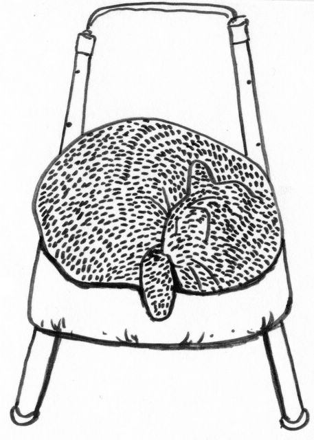
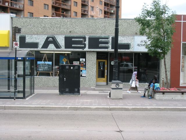
jenni's signage ideas. also, she made comments on each of the "blue" designs. also included here are my feet.
cruise night, portage ave.
MISSING-- HAVE YOU SEEN THIS PERSON??? goes by "killah", used to play blues, drink wild turkey, hang at label. don't let the flattering picture fool you--he's a truly sinister character (operates canada's only kitten smashing factory). if you see him, tell him there's a warm drum kit waiting at the label...
"On Guard for Thee" ... the CBC building, winter sunset
Reve, by Denis Prieur
Bateau, by Denis Prieur
round two of the planting show is soon to come... and may be visiting a gallery near you quite soon (TO? MTL?)
ah yes... the countourists. when will these three meet again? in thunder lightning or in rain? when the hurlyburly's done? when the battle's lost and won? IT'S TIME FOR A COUNTOURISTS SHOW!!! (by the pricking at my thumbs, something countour this way comes)
a blast from the past. note the penetrating, all seeing gaze--the lidless eye, wreathed in flame.
If i die of vanity promise me promise me if they bury me someplace i don't wanna be/ you'll dig me up and transport me/ unceremoniously/ away from this swollen city breeze/ garbage trees/ whispers of disease acts of enormity/ lower me slowly and sadly and properly/ get ry cooder to sing my eulogy! -- gord downie ("at the hundredth meridian)
Friday, July 29, 2005
So these are some shots I took from the alley of the Label, two different days and two different times of day. Camera 1, camera 2, camera1, camera 2. Sorry it ain't haystacks or cathedrals.
Shawna Plischke 18, click here if you would like to see another portrait of Shawna
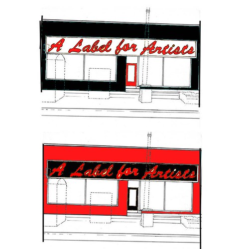
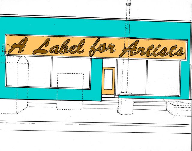
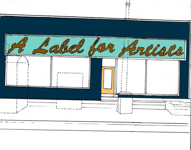
i would highly reccomend a black white and red color scheme. black and white because its an art gallery. red for canada and to attract attention. I HIGHLY RECCOMEND THIS. Other colors go out of style quickly.
Hello fellow labellers, I put a little drawing together of the front of the building, with a few color combos. I know you're all photoshoppers, so feel free to give it a try with your own color suggestions. I find that whenever I work on a design like this the first thing I do is draw it as it is, so here it is! and now the fun part of color selection begins. Frosted glass is in, maybe for the color of the plastic? Hmmmm, bonne chance!
A Love for Art was a collaborative blog for visual artists, musicians, writers, and social scientists. This blog has evolved into a new blog called BETA, go check it out!