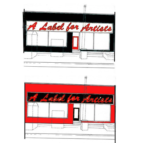
i would highly reccomend a black white and red color scheme. black and white because its an art gallery. red for canada and to attract attention. I HIGHLY RECCOMEND THIS. Other colors go out of style quickly.
Ya, I mean just for buildings. Like sometimes its cool wearing teal but could you wear teal every day in every situation. Its too bad you cant just press a button and have a different color scheme for every different day and change of seasons. But you cant and so we must design for longevity. A scheme that will fit for every show. For all-purpose simplicity I find black to be the rule. Black is the color you wear to the grammies, the color you wear to the prom, the color you wear to the big business meeting. But it has the implication of darkness so you have to throw some white in there. White is the color of nothing, the color of the gallery, the color of the blank page, the color of the temple. But black and white would not attrack enough attention. Hence Red. I find Red to be the color of the Rooster. The color of power. The color of look at me Im wearing red. Through these three together and you have magic. Simple yet bold.
i think that we need to be clear about the fuction of the building on the sign. i often hear from people they don;t understand what a label for artists is. i likethe font you selected. classy but where is "label" logo, figure ect.
the colours onthis one remind me of the white strips probly b/c thats what i am listening to.
I agree with being clear about the function. I had put Label Gallery on the sign at first, but next to the Bridal Gallery, people would have come to you to get signs made(now that's ironic, at least at this very moment). The things I intend to add on the next design I do will be a letterbox and the 'Label' figure. More soon, fellow baboons.
No Beige ! Andrew's right you need red or its colourfull equivalent. It is a tricky balance though. I laughed pretty hard at the "pee-wee's playhouse" comment. In the tigers defense this powerful colour scheme is more than rock bands and child entertainers but... I think The Label shouldn't be trying to keep up with fashion and trends or guessing what the future will like for building colours. If you want it to stand out and be competitive with artistic buildings look at others that have been transformed by a simple layer of paint. We have to collectively admit the back of the building has always looked spectacular, while the front remains a Winnipeg eye-sore. I would suggest letting your favorite Graffitiers go wild on the front of the building, and then add a simple black and white sign. You could champion the sister gallery and graffiti as an art form in general. Imagine the look on Tom Ethan's face(head of fake pride wpg.) as he drives by it each morning. I guess it comes down to what kind of Gallery Label wants to be? It could be stuffy and hyper self conscious about superficial appearances like most galleries, or the Label could be a Gallery for the people. A label for the mass Komar and Melamid population. A Label for Artists.
If you want the Label to be a gallery for the people, the largest section of the population is the baby boomers, and as far as I know, they hate graffitti. And I'm afraid Tom Ethan is a baby boomer. Sigh. I agree it comes down to what is the label trying to be? Or better yet, what WILL the label be in the future. I imagine keeping the building clean and presentable is key. Black and white sign, professionally printed, I hate to say it, will keep the Label's resale value. And get rid of those ugly tiles on the front. Replace it with a clean look. All white would be nice. Too bad you couldn't restore it to its original brick splendor. I'll post an image of the building in regards to its surroundings as well, everyone should consider that when making their comments.
A Love for Art was a collaborative blog for visual artists, musicians, writers, and social scientists. This blog has evolved into a new blog called BETA, go check it out!
11 comments:
I do like the top one though, black building, white sign, black lettering. Simple, elegant, fashionable even.
Ya, I mean just for buildings. Like sometimes its cool wearing teal but could you wear teal every day in every situation. Its too bad you cant just press a button and have a different color scheme for every different day and change of seasons. But you cant and so we must design for longevity. A scheme that will fit for every show. For all-purpose simplicity I find black to be the rule. Black is the color you wear to the grammies, the color you wear to the prom, the color you wear to the big business meeting. But it has the implication of darkness so you have to throw some white in there. White is the color of nothing, the color of the gallery, the color of the blank page, the color of the temple. But black and white would not attrack enough attention. Hence Red. I find Red to be the color of the Rooster. The color of power. The color of look at me Im wearing red. Through these three together and you have magic. Simple yet bold.
These are intense, but I like for some reason... hmmm, I wonder why intense?
:)
Actually brown is the new black, get with it.
I think the red backdrop is kinda Pee-Wee`s Playhouse. I`m not sure if that`s a good or annoying thing.
i think that we need to be clear about the fuction of the building on the sign. i often hear from people they don;t understand what a label for artists is. i likethe font you selected. classy but where is
"label" logo, figure ect.
the colours onthis one remind me of the white strips probly b/c thats what i am listening to.
stan dangerman
I agree with being clear about the function. I had put Label Gallery on the sign at first, but next to the Bridal Gallery, people would have come to you to get signs made(now that's ironic, at least at this very moment). The things I intend to add on the next design I do will be a letterbox and the 'Label' figure. More soon, fellow baboons.
No Beige ! Andrew's right you need red or its colourfull equivalent. It is a tricky balance though. I laughed pretty hard at the "pee-wee's playhouse" comment. In the tigers defense this powerful colour scheme is more than rock bands and child entertainers but...
I think The Label shouldn't be trying to keep up with fashion and trends or guessing what the future will like for building colours. If you want it to stand out and be competitive with artistic buildings look at others that have been transformed by a simple layer of paint. We have to collectively admit the back of the building has always looked spectacular, while the front remains a Winnipeg eye-sore. I would suggest letting your favorite Graffitiers go wild on the front of the building, and then add a simple black and white sign. You could champion the sister gallery and graffiti as an art form in general. Imagine the look on Tom Ethan's face(head of fake pride wpg.) as he drives by it each morning. I guess it comes down to what kind of Gallery Label wants to be? It could be stuffy and hyper self conscious about superficial appearances like most galleries, or the Label could be a Gallery for the people. A label for the mass Komar and Melamid population. A Label for Artists.
If you want the Label to be a gallery for the people, the largest section of the population is the baby boomers, and as far as I know, they hate graffitti. And I'm afraid Tom Ethan is a baby boomer. Sigh.
I agree it comes down to what is the label trying to be? Or better yet, what WILL the label be in the future. I imagine keeping the building clean and presentable is key. Black and white sign, professionally printed, I hate to say it, will keep the Label's resale value. And get rid of those ugly tiles on the front. Replace it with a clean look. All white would be nice. Too bad you couldn't restore it to its original brick splendor.
I'll post an image of the building in regards to its surroundings as well, everyone should consider that when making their comments.
Just throwing ideas out there.
Post a Comment